I have gained valuable experience working on projects in ArcGIS Desktop and Pro, 3GIS and ArcGIS Online, over the last several years. This page features workflow of tasks I have completed in professional and academic settings.
Experience using ArcGIS Online
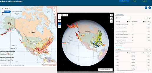
Here is a Web Experience I built with a 2D and 3D map, as well as tabular data, of hurricanes and earthquakes in the United States from 2000 - 2008. I used Esri's Experience Builder to create this experience.
The main task when creating an experience is to establish a section frame that will contain the map, and add widgets to use for analysis. This is done by secting the Page icon on the left, then selecting the layer I want to work with. Then I select the Insert Widget icon(+), and drag any widget I want to use into the section frame, or on the page outside the section frame. From there, I give it the settings I want with the Content tab selected in the right pane. I style the map with the available specifications in the Style tab.
Geospatial Data I Published Online For The Ledcor Engineering Team
How to Publish a Layer Online
Summary: The workflow begins by preparing the layer in ArcCatalog, then symbolizing the mxd, making the service, then publishing in ArcMap. Then adding the layer to the online platform in ArcGIS Online.Workflow
In ArcCatalog
- Import the layer to the SDE with the name it will have in the SDE
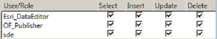
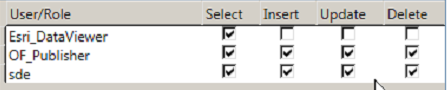
- Set Privileges: Right-Click the Feature Class -> Manage to access the Privileges and Feature Class Settings:
- Register as Versioned
- Create Attachments if fielders need the ability to add photographs to the layer.
- Enable editor tracking if it is in the working database. This adds fields that records who added a record and when.
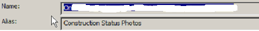
- Change alias so it appears with a descriptive name in the mxd and elsewhere
- Add the layer from the SDE to the mxd.
- Set the data source to the SDE listed in the Mapping\EGDB_Connections folder.
- Symbolize the feature types
- Set the visible scales
- Save the mxd to Web_Mapping\MXD
- Make the service.
- File>Share As>Service brings you to this.
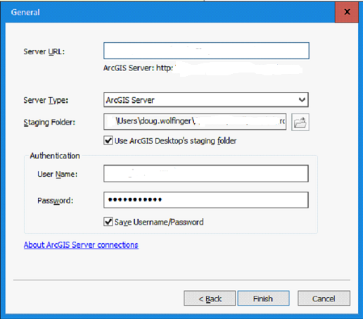
- The Service name should be the same as the mxd
- Publish to X_OneFiber for the Chicago market.
- Publish the service.
- In Service Editor go into Capabilities, uncheck KML and, only if the layer will be editable, check Feature Access. Otherwise, it will be a map service.
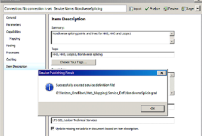
- Fill in the Item Description fields
- Click Analyze, then Publish.
- Go to the Server Manager
- Click Feature Access if the layer will be editable. This will create a REST url that ends in “FeatureServer”. If it’s not editable, click Mapping.
- Copy the REST url
- Symbolize the feature types
- Go to my ESRI online account
- Click Add Item and choose From URL.
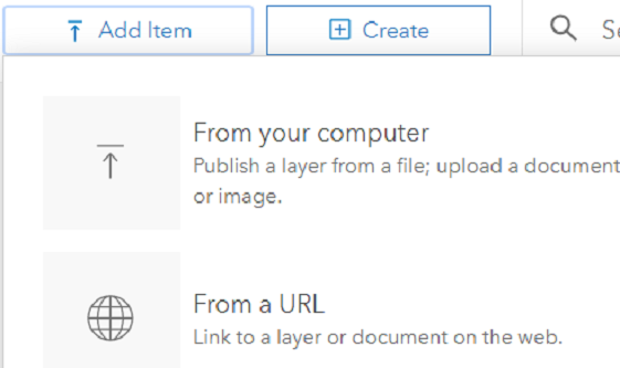
- Paste the REST url into the URL field, click outside of it, then login and click Add Item, then OK.
- Establish sharing for the layer
- Go to Content in my online ESRI account and choose the groups to share with.
- Add the layer to the map
- Go to My Organization, click Maps and search for the map to which the layer should be added.
- Click Add>Search for Layers and add the layer
- Click the + to add the layer to the map and Save.
- Click Add Item and choose From URL.
In ArcMap
In ArcGIS Online
Publishing Task:
- Z-Values needed to be disabled in order to enable publishing of the layer. I disabled them, following the steps on this webpage: https://support.esri.com/en/technical-article/000010389
- Set the data source for each layer in the mxd to each corresponding layer in the SDE Owner database.
- Set the visible scale ranges and symbolized the two layers in ArcMap.
- Saved the mxd with the same name and deleted the original service so Arc would let me re-publish.
- Added the layers to AGOL and added to the online map.
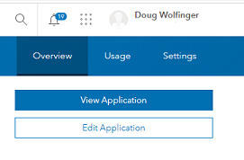
- I searched for the WebApp in the My Organization page of my ESRI account and clicked Edit Application to open WebAppBuilder.
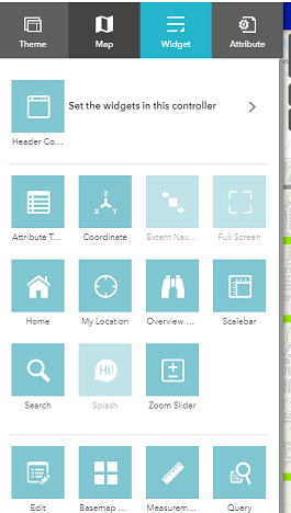
- Then clicked Widget to bring up the widgets and opened the Search widget.
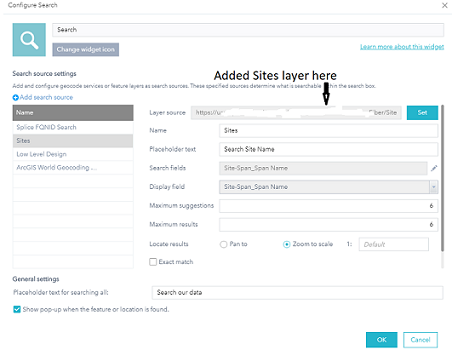
- Added the Sites layer to the Search widget.
- Specified the Name field as the one to use in the search.
Responsibility
Add hub locations and boundaries to the Construction Collector webapp and make the Sites layer searchable.Workflow
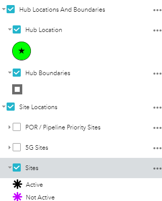
The designer wanted sites to be searchable by name.
Academic Experience
This is a summary of an academic project on which I gained experience with Arc Toolbox tools, including those for Data Management, Analysis, Spatial Analysis and Conversion. Below is an academic example of a project for which I used ArcMap tools.
Coursera MOOC: Geospatial and Environmental Analysis
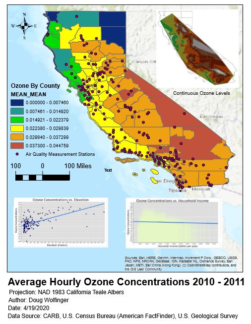
As a student in the Coursera UC-Davis MOOC, Geospatial and Environmental Analysis, I was tasked with analyzing ozone concentrations in relation to household income and elevation above sea level in California. The project was based on data for those variables from 2010 to 2011.
Tasks, Hypothesis, Workflow, and Conclusion
I need two maps and two graphs. I will need to join layers and tables to make the graphs and maps. The results can be used for both.
Data provided: elevation, ozone, and household income data.
Tasks
Form a hypothesis about the variables. Consider the relationship between lower atmospheric ozone concentrations and elevation is and the relationship between ozone concentration and household income is. Are there any relationships at all? This is my investigation.Hypothesis
I would think the relationship between income and ozone concentrations would be inverse (lower income, higher concentrations) and the ozone to elevation relationship would be direct.Workflow
Join using Extract Multi Values to Points tool
Attach elevation field from DEM raster to the attribute table of the air_quality_locations_ozone layer
With this layer, create a TIN and raster for ozone concentrations to compare ozone data vs. household income
Convert AirQualityTIN to raster:
Create a graph of ozone and household income
Dissolve census_tract_with_income_ozone to county level
Conclusion
According to my two graphs, I was right because the income trendline goes down to the right and the elevation trendline goes up to the right. I think the dataset and results could be improved by adding air quality monitoring stations in the less populated eastern half of the state.Final Results
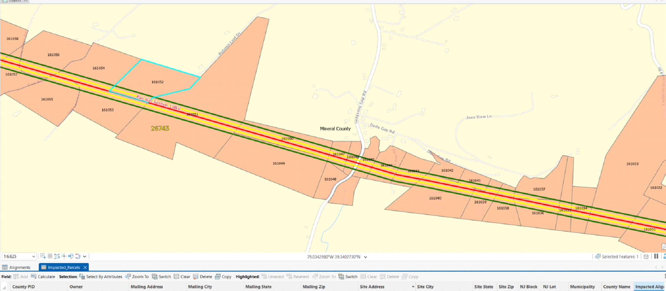
- I set up parcel verification projects like this by adding the owner's name, mailling address and site address, municipality, county name, impacted alignment, impacted corrider, impacted vegetation, adjacent, line list, and line list number fields from the Impacted layer, which contains the existing parcels.
- The county's parcel data viewer provides a map of the area and the PID number, owner's name, mailing address and site address (sans town, state and zip code).
- Once the attributes are populated I run the Select by Location tool (below) to find all parcels intersecting the red alignments line, and use the Sequential Numbering tool to generate a numerical list that represents each parcel. I run the Select by Location analysis against the yellow easement buffer and green vegetation buffer, as well, for transmission power lines. But there is no need to analyze those intersections for this line because it is underground fiber.
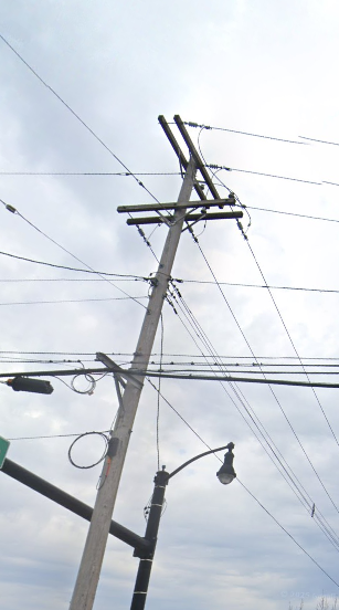
- Identify distribution wires from pole to pole, analyzing imagery to indicate whether to confirm the existence of distribution wires.
- Google Earth was used where street view was available. GeoDigital was used to inspect poles that were not shown in Google Earth's Street View.
- The pole in the above picture contains transmission, distribution, communication wires and a guy wire. The view direction is north
- The three wires on top, extending east are transmission (Tx), which are always near the top of a transmission pole. The thin wire just below the Tx is a guy, connected to a stub pole to the west. Distribution wires (Dx) start at the crossarms below the guy wire, evidenced by the insulators, two of which are visible. Another guy wire is seen below the Dx, extending south. Below that the clamped wires are Dx, and the others in that area are for the light and traffic. The next light wire is a nuetral, which runs east and west. Communications wires, which are always below a neutral if the pole has a neutral, are next. Cable wires are usually dark and thick, as seen on this pole, accompanied by a black box, which is seen to the left. This is standard arrangement on a pole, with Tx, Dx, Communication, top to bottom.
- For this pole I would enter "Y" in the Dx attribute and "Y" under joint use, since the poles contains both Dx and communications wires.
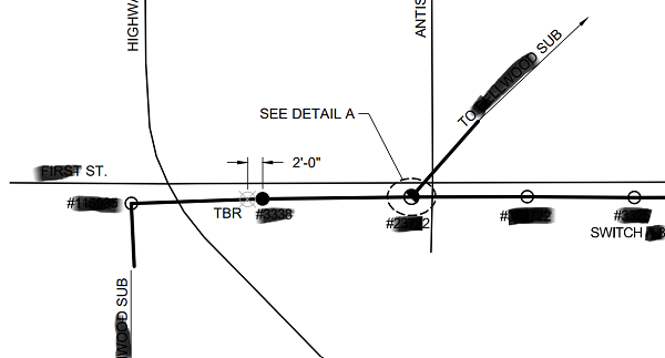
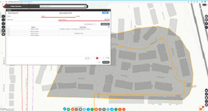
- The above plan shows part of a circuit with new (black circle), proposed (half filled circle), and existing structures. I manually added these as points into the geodatabase if the structures were missing and entered their installation year if existing.
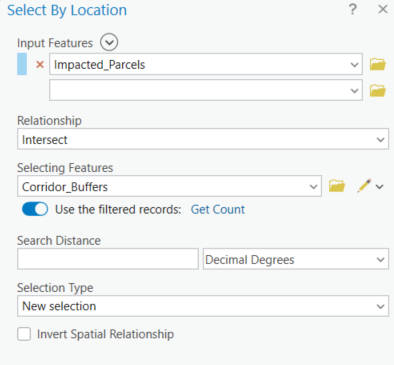
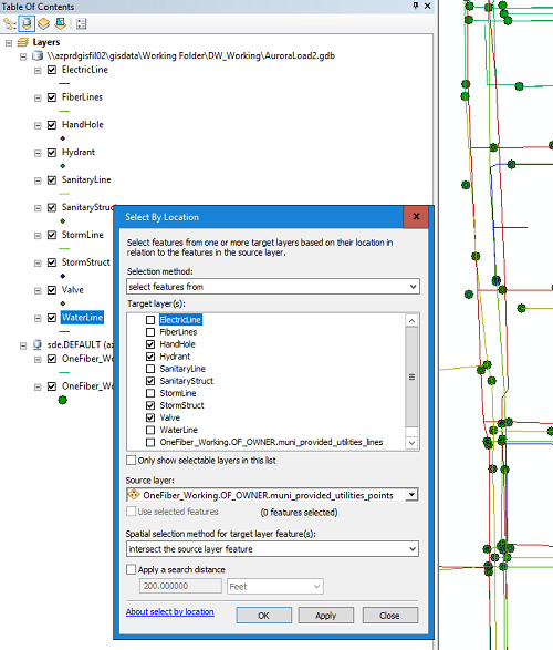
- Select by Location
- Copy the SDE layers and load the copies into ArcMap.
- Load the new layers into ArcMap.
- Open Select By Location and choose the new features as the target layers. Only point features are selected so as to match the feature type of the source data.
- Choose "intersect the source layer feature".
- Click OK and only the duplicate features in the target layers will be selected.
- Delete the selected features from each layer, then load the remaining features into the SDE.
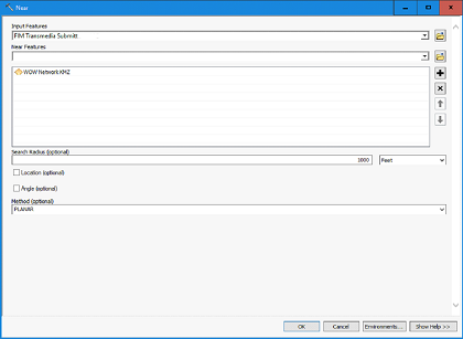
- Since we had no license for Spatial Analysis tools, I used the Near Tool, which required use of ArcMap Advanced. If Near was inaccessible, I could have established a buffer around each WOW line, then run a Spatial Join of fiber optic lines with the buffer.
- Transmedia as Input features and WOW as Near features.
- Provided the output in a spreadsheet with OLT Name, fiber segment and distance to the WOW cables, sorted by OLT Name
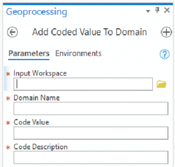
- Run the Add Coded Value To Domain tool once each for each value choice
- Enter the value in the Code Description field so that it will show up in the drop down menu in the attribute table's field. Code Value and Code Description get the same text because the options the user sees should exactly match what they want to enter into the field.
- Run the Assign Domain to Field tool
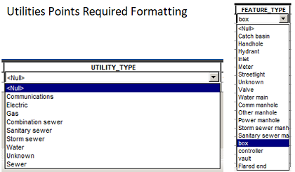
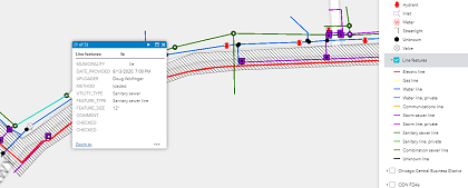
- Attribute values for specific fields in the each layer must be entered exactly as shown in this example for point features:
- Select data in the new data layer by municipality since all the new data was added for the same village
- Add Utility Type to the new layer
- Select By Attributes all features of specific utility type with this SQL statement: SELECT FROM (LAYER NAME) WHERE DESCRIPTION/ALIAS LIKE '%Storm%'
- With all the Storm features selected, the value of "Storm sewer" can be Field Calculated into the Utility_Type field for the appropriate features
- Load the new features into the SDE: Right click the SDE layer in ArcCatalog, select Load, add the newly formatted layer, click Next x3, Finish
- The new points and lines appear on the online platform
- Open Select by Attributes from the attribute table of the Points SDE layer
- Enter: MUNICIPALITY = 'Yorkville' AND FEATURE_TYPE <> 'Streetlight' AND (UPLOADER = 'Jane Doe' OR UPLOADER = 'John Doe')
- Hit OK
- Zoom in so 3GIS can display the features
- Select Fiber Cable for Layer Type
- In the search window, select Fiber Cable, FQNID, Equals, and enter the FQNID, which is the segment name
- Select Fiber Cable in the dropdown so 3GIS knows what to search for
- Click the Selection Polygon icon and draw a polygon around the features
- Select the appropriate FQNID in the list that appears and click Associate
- I begin by logging into 3GIS, then opening the construction product development map for the market I am working in, using my ArcGIS Online login credentials.
- I then open the list of workorders that are open to me and activate the work order that is due the soonest.
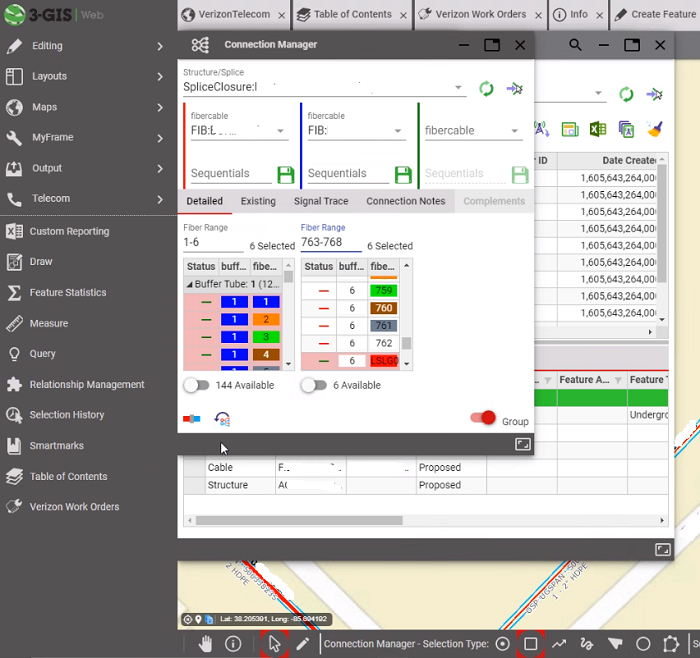
- Work begins by creating the following essential layers (circled): structures (e.g., handholes), fiber cable, span (the cable's conduit), fiber equipment, poles (if the site is aerial), slack loop, and splice closure.
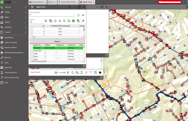
- The endgame of creating an as-built site is to run a signal trace to track the fiber from the site back to its hub.
Arc Desktop, Pro and 3GIS Experience
Tasks I have completed in a professional setting
ArcGIS Pro Experience
My current responsibilities include updating parcel data along transmission and fiber lines in counties within the footprint of the power company.
Task
Populating name, mailing address, location addres, municipality and county that are on the deed from parcel to parcel.Workflow
ArcMap Experience
Terrain Analysis
I worked with the transmission team my first 3 years at Burns & McDonnell, adding missing structures, updating installation years and mapping distribution along circuit lines, applying terrain analysis in GeoDigital and Google Earth.Task
Engineering Drawing Interpretation
Below are more examples of experience from professional projects. The work for all of these was done in ArcMap.
Spatial Analysis
Task
Add new features from layers that contain features already in the SDE without adding the duplicate features.
Workflow
Task
Find fiber optic segments within 1000 feet of WOW cables.Workflow
Data Management
Task
Edit the domain of a certain attribute in the SDE in order to provide options for values for users to enter.Workflow
Task
Format new utilities points and lines data to conform to utilities layers on the SDE to enable proper display on the online platformWorkflow

SQL Query
Task
Search the points layer in the SDE for all nonStreetlight utility point features in Yorkville that were uploaded by two employeesWorkflow
3GIS Experience
Task
Assign fiber segments to individual permitsWorkflow
Task
To design outside plant fiber optic cable sites with features, including the fiber cable and handholes, that will deliver 5G technology to businesses.Workflow
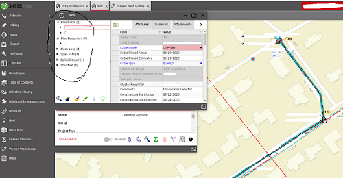
Fiber cable is selected in the image and its attributes are shown.
To create a connection go to the Connection Manager tab. Enter the ranges and click the blue and red connection button in the lower left corner of the connection manager window.